





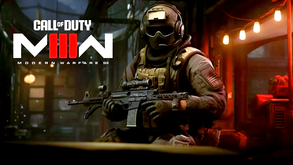
Before any changes are made, they are to be tested in MW3. But even the first feature is highly controversial
Activision wants to do things differently with updates for CoD Modern Warfare 3 from now on. In the predecessors, a change was implemented directly into the game – whether the fans were happy with this has only become apparent
Now there will be a test phase in a separate mode where players can get to grips with the feature. If it is well received, it will be adopted – if not, it will be dropped or reworked. We now know what will be tested first and discussions are already in full swing.
Better opponent visibility
It’s a topic that Modern Warfare 3 has been pursuing since the beta: How easy are your opponents to recognize? During the test phase before release, visibility was still criticized, but with nametags it has increased significantly. But that’s obviously not enough for Activision
With red outlines your opponents will stand out more clearly against the background. It will also quickly become clear whether you are dealing with friend or foe. According to insider CharlieIntel, these outlines will appear as soon as you aim at your potential victim using ADS
NEW: The first Experimental Playlist in Modern Warfare 3 MP will be a mode where players have outlines enabled.
This would be when you ADS on a player, a red outline will appear for enemies. Coming soon. pic.twitter.com/19vppAmXSb
– CharlieIntel (@charlieINTEL) November 15, 2023
Is that even necessary?
Many players consider the planned feature to be superfluous; thanks to the nametags, visibility would currently be completely sufficient. The CoD expert (The GhostOfHope) also writes:
Nametags and the general recognizability are already good. Why do we need something as tasteless as opponent outlines?
But under his post there are also some users who disagree with him. Especially due to skins that are difficult to recognize, an improvement is advantageous, as (Conall) for example points out. (Zach) on the other hand, is still undecided when it comes to implementation via outlines:
Visibility still sucks from time to time, but at least it’s better than in the beta. I’m not sure how I feel about the outlines though.
Whether the outlines will ultimately be introduced in the final game is, as I said far from decided. For now, they will probably be tried out on the experimental playlist.
What do you think of red outlines for opponents? Do you think this visual aid is more likely to disturb you and take you out of the immersion or is the visibility and the resulting minimized frustration factor worth more to you? Let us know your opinion in the comments below:


