Opinion: Dani~ is really looking forward to DA: The Veilguard, but with every gameplay video, her concern grows. Because iconic enemies, of all things, look terrible in her eyes – and not in a good way.
The dragons were the last straw in a barrel that has been steadily filling since the reveal of Dragon Age: The Veilguard. Now it’s dangerously close to overflowing—which is why I have to get my concerns off my chest.
I had successfully repressed the creepy first trailer and its Overwatch party atmosphere because the gameplay shown made me optimistic. However, the design of demons and darkspawn was already giving me something to think about. Now that a fight against two dragons has been revealed, I can no longer talk myself into it: The enemy design of The Veilguard is a complete failure for me.
That I’m not alone in this has been apparent for months in the comment sections on YouTube, Reddit, X and Co. I fear that Bioware is really squandering a lot of goodwill here – with their most important game in years, of all things.
Where are the edges?!
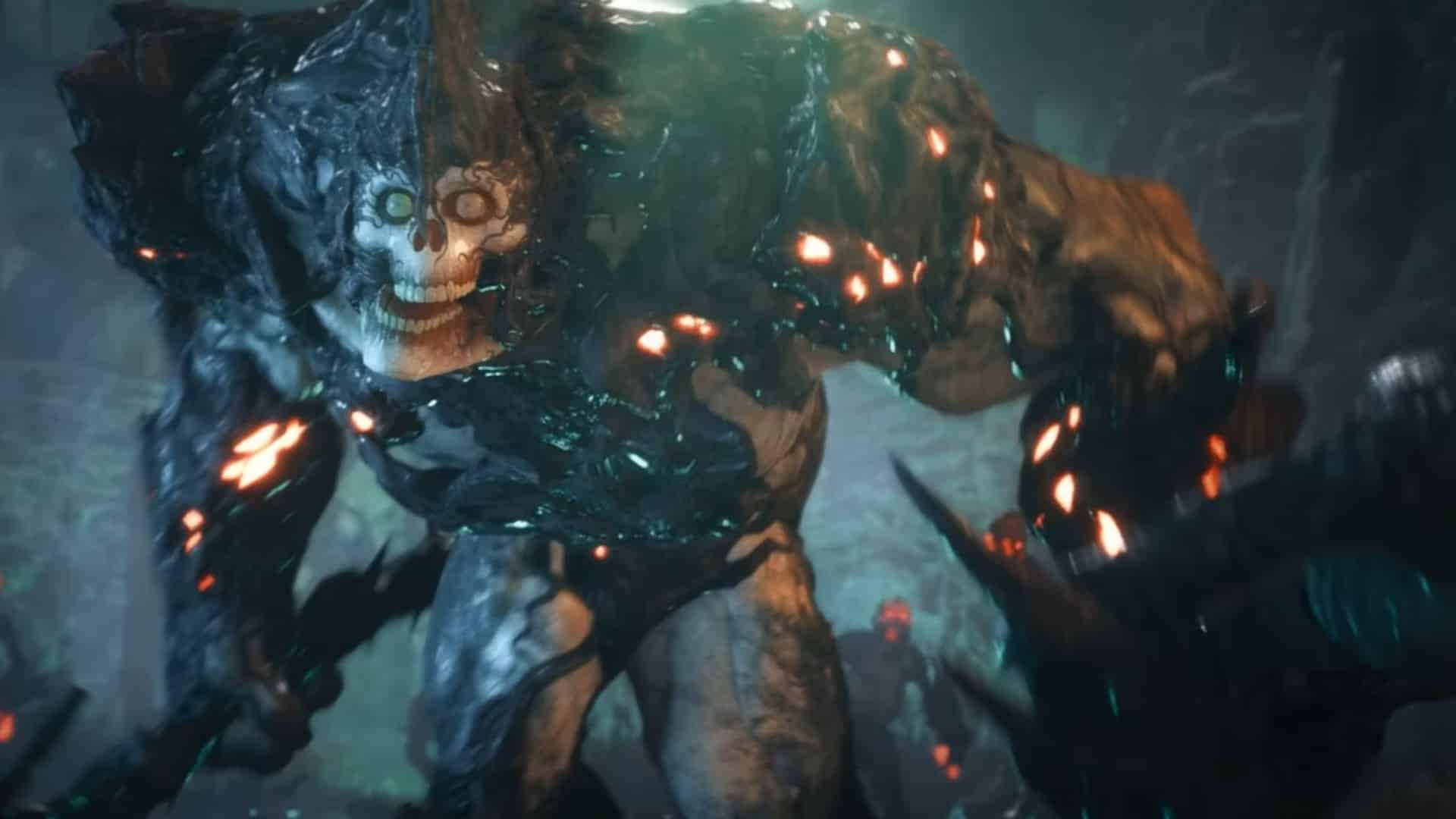
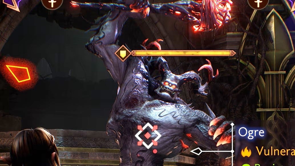
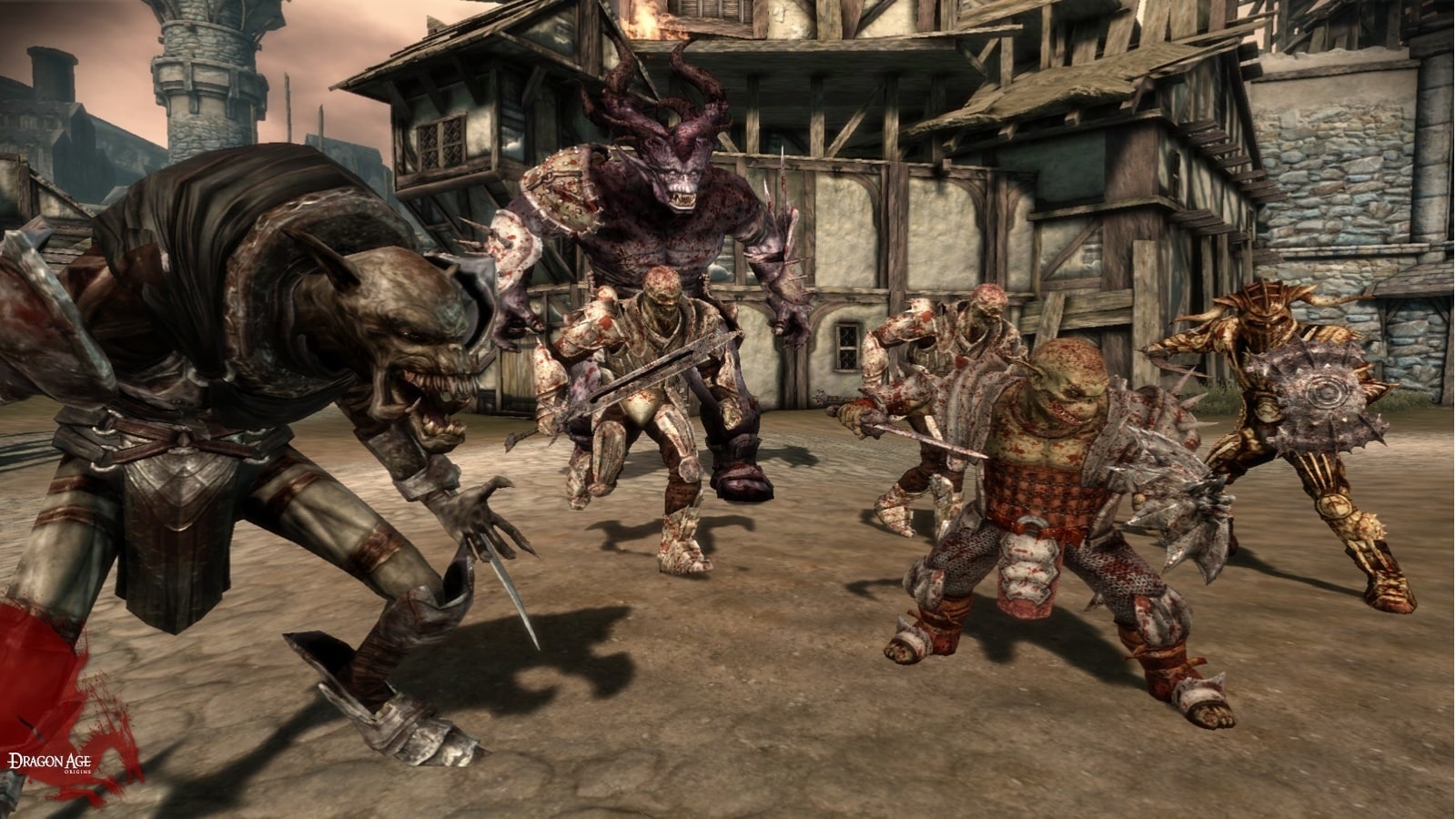
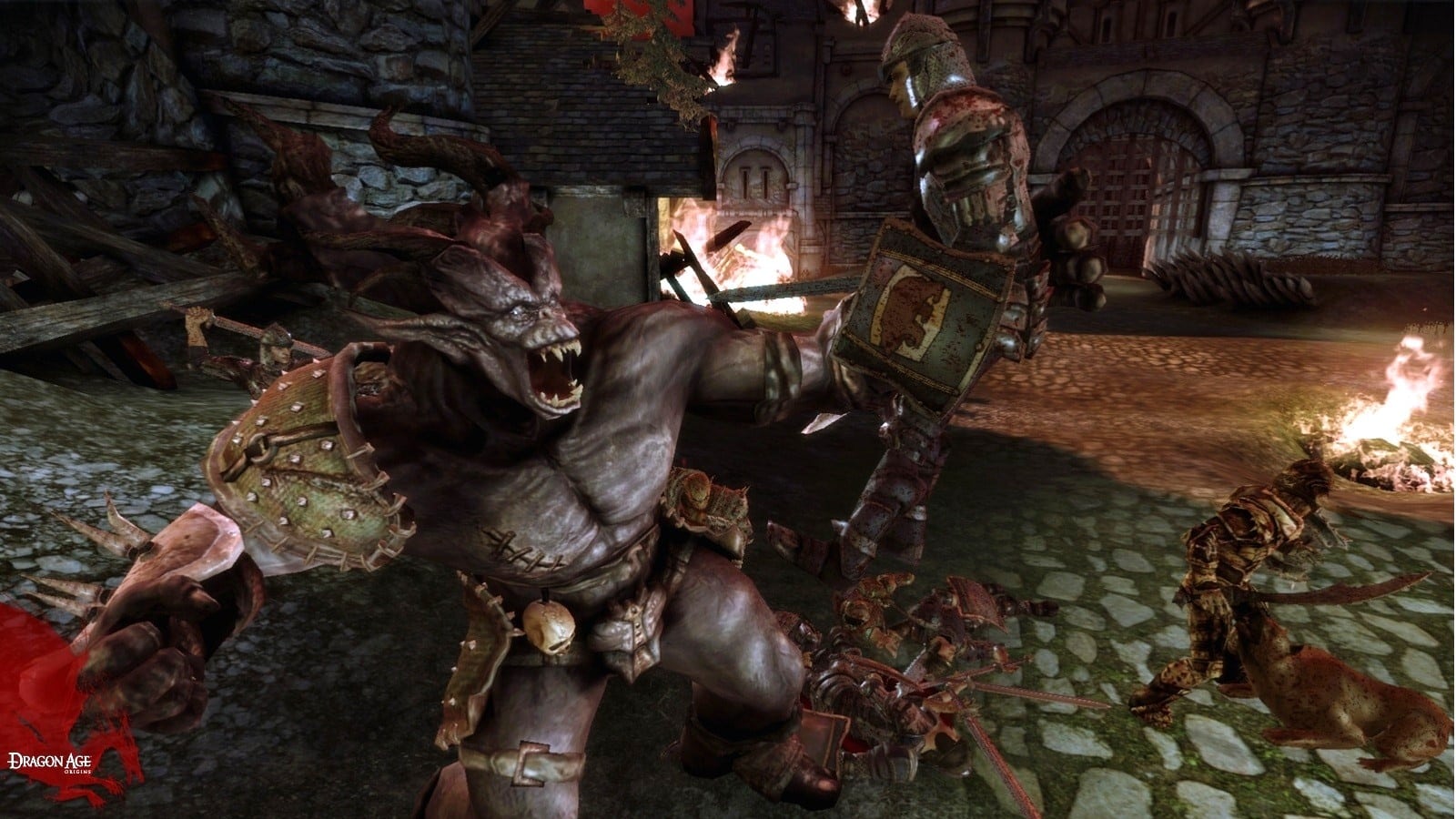
Sure, design is a matter of taste, but The Veilguard just doesn’t connect with its predecessors here. In a Dragon Age, fans rightly expect fearsome enemies that gave us pleasant shudders in the predecessors – I only say Spider Demon in the Void. Here are a few comparisons:
The darkspawn look exactly as you’d expect for the role: twisted, distorted creatures that mock the natural world of the creator. The toothy mouths and hate-filled eyes tell me, without words, that the races of Thedas cannot afford to lose this war, or they’ll end up as fodder. Wonderful!
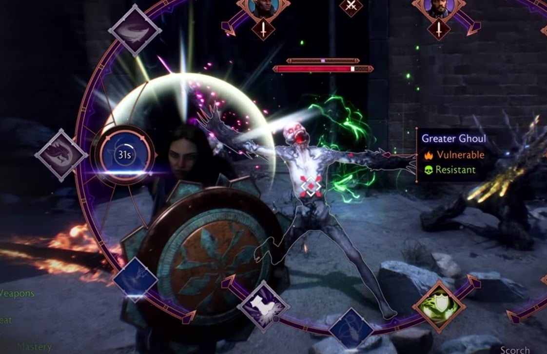
The fact that the developers of The Veilguard want to give the enemies a whole new design makes perfect sense to me. Not only because of the better technology, but also because, according to the lore, it is a new type of Darkspawn (because of the unleashed Elf Gods). The same probably goes for demons.
But they made the worst design mistake of all: Many creatures look silly. If they were just ugly, I could easily forgive that. But the fact that in the gameplay videos, oversized googly eyes stare at me from every third opponent, shattering my immersion, just hurts.
I wonder: does Bioware really want me to take such adversaries seriously? Or are they deliberately designed with irony? With a wink, so to speak. Of course, that would be a stark break with the tone of the previous games.
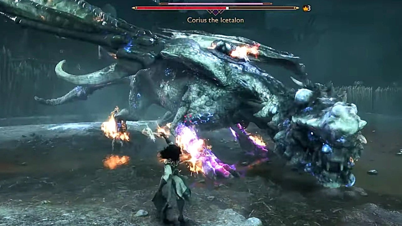
Worst of all, as mentioned, were the dragons. They only play a small role in Dragon Age (why the series is still named after it is explained by colleague Fabiano here). But since Inquisition introduced them as difficult and impressive bosses, I was hoping for a reunion in the sequel.
Cute dragons, yes please – but not in Dragon Age
Two winged scaly carriers were seen in an official video and phew, they just don’t look good to me at all. The bulbous, oversized heads, the bright splashes of color and, above all, the strange, gapped and oversized teeth leave me at a loss.
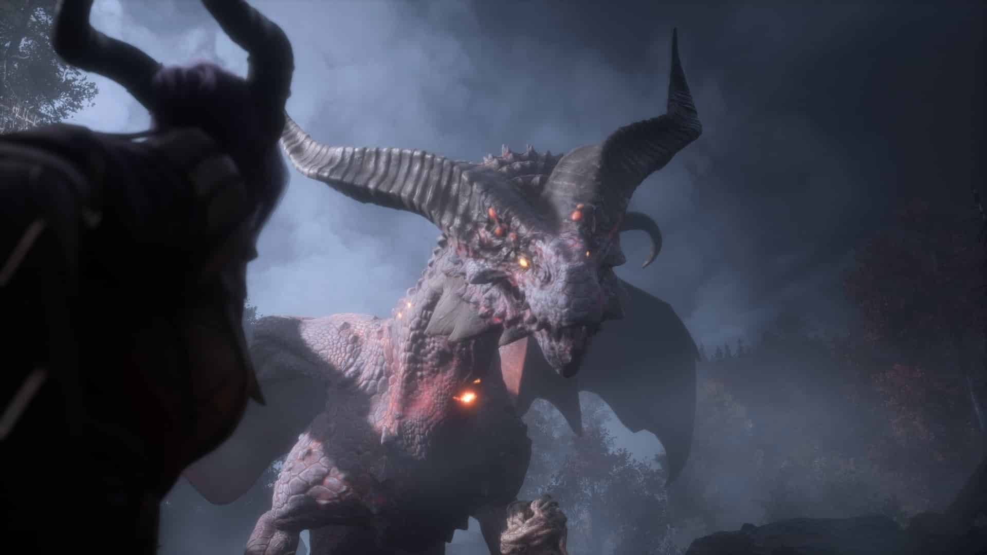
Interestingly, during his play session of The Veilguard, my colleague Fabiano discovered a dragon that looks much more dangerous, meaner, simply more dragon-like, and I really like it. It also fits wonderfully into the legacy of Dragon Age dragons. Take a look for yourselves:
So there is some hope, but I fear that much of the enemy design is a significant step backwards from its predecessors. To be fair, I have to make a few qualifications: I haven’t played the game myself yet, many of the scenes shown so far take place at night (which may obscure details), and there are likely to be many enemy models that have not yet been shown.
Can I get used to the look? Or will it really constantly pull me out of the immersion, as feared? That will probably only be revealed at the release on October 31.
Whether Bioware has done itself a favor with the new style is at least doubtful. You could find that brave – or criticize it like me. On social media, negative opinions seem to prevail, as can be seen from the many prophecies of doom “This looks like Fortnite / Overwatch / a mobile game” at YouTube and co.
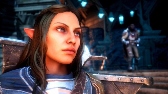
I personally don’t have any major issues with the rest of The Veilguard’s graphic style; I actually like the environments shown and the companions look great to my taste. It’s the enemies that make my stomach turn – not in the good way that some of the previous creatures did.
Whether it’s a holdover from Dragon Age’s online ambitions or if there are other good reasons for the strange enemy design, I don’t know. Maybe we’ll find out in a few years, but maybe this is just the new art style direction Bioware wants to take with its games. We’ll see what the next Mass Effect looks like.
Despite this criticism, I’m still really looking forward to The Veilguard. But I can’t help but already hope for mods that at least change the ghastly googly eyes – I just don’t understand why the designers chose them of all things. The predecessors provided so many cool templates!

