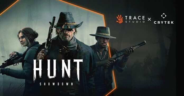
After massive criticism from Hunt players about the new user interface, developer Crytek has now responded and promised rapid improvement
Players ofHunt: Showdownshould actually have every reason to be happy right now.Because the popular extraction shooter took an important step into the future withthe fundamental relaunchlast week.
However, instead of boundless joy over the fresh engine, new map or the new bossthere is currently a lot of criticism in the Steam reviews of Hunt.Because the new user interface is offending many users.
Optimized for consoles
The new interface, with itsclear focus on console optimizationwould leave all PC gamers by the wayside.
On the computer, the menu navigation, which admittedly already looked rather spartan before the update, is nowcompletely unclear and confusing(see screenshots below). Some buttons are simply superfluous; you can no longer find what you are looking for. On the other hand, the game never misses an opportunity to point out the existence of its Battle Pass
UserA Naghty Narwhalsums it up ironically:The new interface feels like running through your bedroom at night in the dark. Except someone has moved all your furniture and you stub your toe 12 times.
Accordingly, theSteam reviewsare currently onMostly negative.
Of over 11,000 reviewers, just a third gave it a thumbs up.
Crytek responds now
In view of this extremely loud and painful criticism, developer Crytek has now been forced to react. Just one day after the launch of the new Hunt version, the studioreleased an initial statementin which the developers vow to do better:
Thank you for your criticism. We are sorry that the new user interface did not meet your expectations. We are paying close attention to player feedback and will take the necessary steps to make the menus more convenient and user-friendly.
The redesign was a long-requested and much-needed improvement, and our design team is dedicated to ongoing improvements. We strive to find the right balance between simplicity and functionality as we continue to refine the user interface.
In a video on Twitter, Design Director Dennis Schwarz also promised to address pain points such as hunter selection and inventory managementas soon as possible. The current execution of the menus is admittedly cumbersome and requires too many clicks.
Hunters, we hear your concerns.
In our new Developer Update, we discuss changes and improvements coming to our new User Interface & Experience. pic.twitter.com/jvvt0l9265
– Hunt: Showdown (@HuntShowdown) August 16, 2024
However, there is no concrete timetable for these changes yet.Crytek asks the Hunt community for a little patience here.
You want to read more about Hunt: Showdown?Then take a look at one of the other texts in the link box above. There, the developers from Crytek reveal their personal favorite loadouts and Jesko explains why Hunt is a special treat for the ears
What do you think of the next-gen update for Hunt: Showdown so far? Do you also find the new user interface impossible or are you less bothered by such small menu details? What do you think of the new map? Let us know in the comments below:


