It doesn”t always have to be high-end graphics to impress: Away from Unreal Engine 5 and photorealism, Kevin has dabbled in small but mighty visual revolutions
I believe that great graphics are among the most important things game developers can work on. Because it is often screenshots, trailers or GIFs with fancy scenes, impressive animations or spectacular panoramas that first draw our attention to a game
As visual creatures, we humans immediately jump at such visual stimuli and associate strong emotions with them. Who doesn”t remember marvelling at the jungle in Crysis ? The horse testicles from Red Dead Redemption 2? The muscles of Kratos from the new God of War?
You can already tell: when we talk about top graphics, we almost always mean spectacular AAA bangers with bold 3D visuals that make graphics cards glow. But the spearhead of technical evolution is broader than you might think. I have come across three virtually unknown projects that revolutionise gaming graphics without maltreating the hardware.
Realistic Suspension
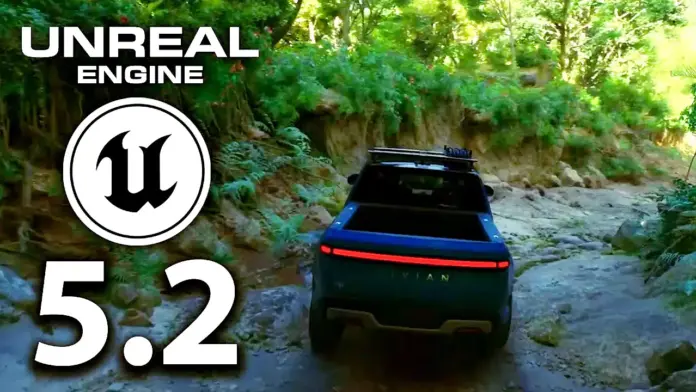
Did you see that amazing video on the new Unreal Engine the other day, where Epic Games drives a pickup truck through a wonderfully realistic forest for the tech demo, demonstrating every detail of the vehicle down to the suspension? If not, I”m talking about this:
A few days earlier I spied something on Twitter that was in some ways similarly impressive. And that, although it looks completely different . Under the studio name noio games, Dutch solo developer Thomas van den Berg develops amazingly chic games like the cute build-up puzzler Cloud Gardens.
In his spare time, the graphic designer is constantly playing around with smaller projects; one of them doesn”t even have a name yet, but seems fascinating despite its technically limited possibilities:
i”ve been painting and putting together this little pixel 3d world
it”s not a game yet..
(but RT if you”d play it 😇)indiedev screenshotsaturday pic.twitter. com/YAyfdYv2AW
– thomas ⛰ vandenberg (🔜 PAX East) (@noio_games) March 14, 2023
Using the Unity engine, van den Berg animated a jeep driving over a wooden bridge in the middle of a swamp. In the process the vehicle sways with every wooden plank; despite the lowest speed, every bump in the road is immediately visible as a wobble of the whole vehicle.
Anyone who has been on rough terrain with a four-wheel drive will be able to feel every one of those wobbles in his bones . I would like to see something like that in a different form in the next Forza Horizons!
Unexpected change of perspective
I can already imagine some of the comments under this article: “I played games with these ancient pixel graphics back in the 80s, I don”t need this anymore!” I know, I know. But let me ask you this: did the games of your youth also look like this?
I will probably have to be careful not to overuse it but this is what the camera switching looks like in game! gamedev indiedev pixelart madewithunity pic.twitter.com/Jp0oNzVYPA
– August Håkansson -… . -.– — -. -.. (@HakanssonAugust) January 18, 2023
Swedish indie developer August Hakansson of the two-person studio Motvind (How We Know We”re Alive) has used 3D technology to create what only appears to be a two-dimensional pixel scene in which the character walks from the living room to the kitchen.
As the camera rotates automatically it gives an impression of the surprising three-dimensionality of the scene before the perspective snaps back into a flat from-front view.
My first reaction to this GIF was, “Something like this works?!” My second: “Why don”t more games use this!!!” This little glimpse into August Hakansson”s new project shows that pixelart games don”t always have to look the same – on the contrary, there”s still a lot of room for innovation here
Like painted
My last graphic tidbit reminds me a bit of Cuphead and Gris, two indie games famous for their very individual graphics. Animation artist Łukasz Rusinek keeps experimenting with hand-drawn pencil sketches that he brings to life on the computer, letting 3D models act in front of the black and white backdrop. The end result is such beautiful scenes as these:
Cloudland. 3d character vs 2.5d greasepencil bg. And some surface painted facial expressions attached to the rig. b3d b2d greasepencil blender3d animation pic. twitter.com/7hYFSQdwIq
– Łukasz (@ukasz_rus3k) February 26, 2023
The design study has an atmosphere all of its own, again playing with the camera perspective: As the nameless character steps up to the precipice, the camera zooms out, adding depth to the masonry. This also highlights the abyss into which the character subsequently jumps.
The fancy graphic style doesn”t seem to be connected to any specific game at the moment; as a feasibility study and inspiration for what is possible in this medium, I still find the short animation impressive.
What is your opinion? Do you find such graphic features exciting beyond “more polygons, more photorealism”? What makes a beautiful game for you? Tell me in the comments and join the discussion!


